A report collects data and prepares it for analysis. A report always includes a data table--a listing of individual records that match the criteria specified for the report, along with summary calculations (sums, averages, and the like) that are calculated on the data columns. A report can also include a chart to display the summary information in graphic form.
Managing Reports
From the Reports tab you can run a report, modify it, or create a new report.
To manage reports:
- Go to Data Insights > Reports
- Choose a folder to list the reports it contains. (Default is All Folders.)
- Click New Report to create a new one,
or select an existing report and use the available options to work with it:
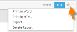
- Edit - Open the Report Wizard to make modifications.
- Print in Word - Creates a Word file and starts the download process.
- Print in HTML - Displays the report in a dialog. Use the Print button to send it to your printer.
- Export - Puts the data into a comma-separated (CSV) file, and starts the download process.
- Delete
Creating a Report
To create a new report:
- Go to Data Insights > Reports
- Click New Report
- Specify the kind of report to create, and select the stream (or Smart Object) to run it on:
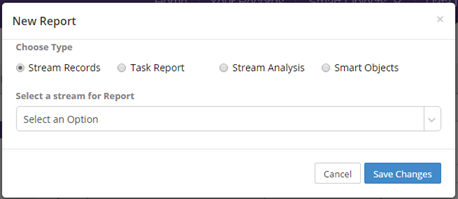
- Stream Records - Create a report on stream records. You have an option to create a combined report across all the stream or just one stream
-
- All Streams - Produces a "combined" report that on records from all of the streams present in your account. Because it is a combined report, only attributes that are common to all streams are available for reporting--attributes such as Date Created, Created By, Status, Summary Info, Date Completed, etc.
- Specific stream - When you select a specific stream, all attributes defined for that stream are available for reporting. For example, a report for 'Site Assessments', will have attributes like 'Site Name', 'Audit Date', 'Score', 'Rating' etc.
- Task Report - Report on tasks from all streams, or from a selected stream. Since all Tasks have the same attributes, they are all available for reporting, regardless of your choice. A Task report is useful to see items such as pending tasks, completed tasks, etc.
- Stream Analysis - Analyze the data that is present in a specific stream. When creating an analysis report, the system looks at checklist fields that are part of the stream definition, and gives you statistics on the distribution of those selections across the records. For example an analysis report of 'Forklift Operator Evaluation' may reveal that during this year safety glasses were not worn 14% of the time. (If the stream chosen for analysis does not have any checklist fields, the report is blank.)
- Smart Objects - Create a report based on records in a Smart Object.
You then use the Report Wizard to specify reporting details. That process is discussed next.
Report Preview and Report Wizard
When you view an existing report, the Report Wizard section is closed, and the Report Preview (data table and/or chart) is the first thing you see:
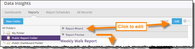
When you first create a report, or edit an existing one, the Report Wizard section expands:
Click Save As to create a new report based on an old one, or click Save to preserve changes to a report you've been modifying.
The tabs in the Report Wizard walk you through the process of defining your report. Whether you are editing a report or have just created one, the process is the same: Tell the system what data you would like see, which records to get it from, and how to arrange it. (If you like, it can also tell the system to create a chart.)
To do that, you visit each of the tabs in turn, and make your choices. You can then run the report to see how it looks. You can keep making adjustments and re-running the report until you're satisfied. Then you'll save it, and give the report a name.
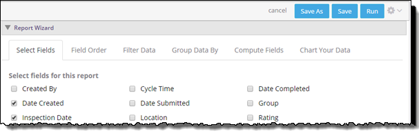
Select Fields
The first step is to select the fields you want to include, as shown in the picture above.
Important:
The only fields that are available for reporting are those that have been identified as
reporting fields for your stream. Standard fields are included by default, but the set may
not include fields you need. If you don't see the fields you want, have your stream
designer make the necessary adjustments to the Stream Definition.
Field Order
Drag the fields in the list to change the order in which they are displayed in the data table.
(Fields at the top of the list appear first in each data row.)
Add as many ordering criteria as you need to get the records sorted in the order you want. In those records, data in the selected fields appears in order, either ascending or descending, as desired.
Add additional ordering criteria for secondary ordering, for example, to order by city within state, you would select State as for first field, and City for the second. You can continue adding as many additional sorting criteria as you like, to get the results you want.
Filter Data
In this section, you determine how records are selected for the report you are creating. You can use as many fields as you need to specify selection criteria. The data in the field for each record in the system is then compared to the specified criteria. If all of the data values match the specified criteria, the record is included.
The kinds of comparisons you can specify depends on the type of data in the field.
Learn more: Filtering Criteria
Group Data By
Collect rows (records) into groups, based on the values in selected fields. For Date fields, you can choose to group by hour, day, week, month, or year.
Start with detail rows hidden, so only the groups are shown, or start with both shown. (When the report is displayed, you can collapse groups you're not interested in, or expand groups you want to see. The Hide detail rows setting only determines its initial appearance.)
Compute Fields
Get a count of records, or specify the calculations to use on numeric fields (sum, minimum, maximum or average). In addition to the calculated values for all records, values are shown for each group in a grouped report.
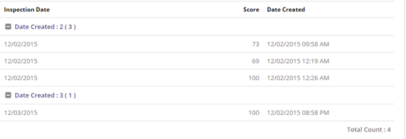
Chart Your Data
Select the kind of chart you want (Bar Chart, Pie Chart, Line Chart), and which field(s) to use for the dimensions of the report, and specify the desired height and width for the chart.
The chart is color-coded with a legend to explain the colors, as shown earlier.